The Temperature Graphs - Historical Series are intended to represent, starting from October until the end of June, the minimum temperature and the maximum temperature (Tmin and Tmax), measured manually in 6 points of the Aosta Valley, i.e. in fixed snowfields in which the Modello 1 AINEVA are daily performed, between 7.00 and 9.00.
The measurement snow fields considered are the following:
|
Station Code
|
Altitude
|
Municipality
|
Location
|
Start of the time series
|
|
04RH
|
1725 m
|
Rhêmes-Notre-Dame
|
Loc. Capoluogo
|
1996
|
|
07CH
|
1420 m
|
Champorcher
|
Loc. Capoluogo
|
1996
|
|
4GAB
|
2380 m
|
Gressoney-La-Trinité
|
Diga Gabiet
|
1928
|
|
3GOJ
|
2540 m
|
Valtournenche
|
Diga Goillet
|
1996
|
|
13SR
|
1750 m
|
Saint-Rhémy-en-Bosses
|
Loc. Ronc
|
1996
|
|
CF01
|
1025 m
|
Pré-Saint-Didier
|
Stazione forestale
|
2007
|
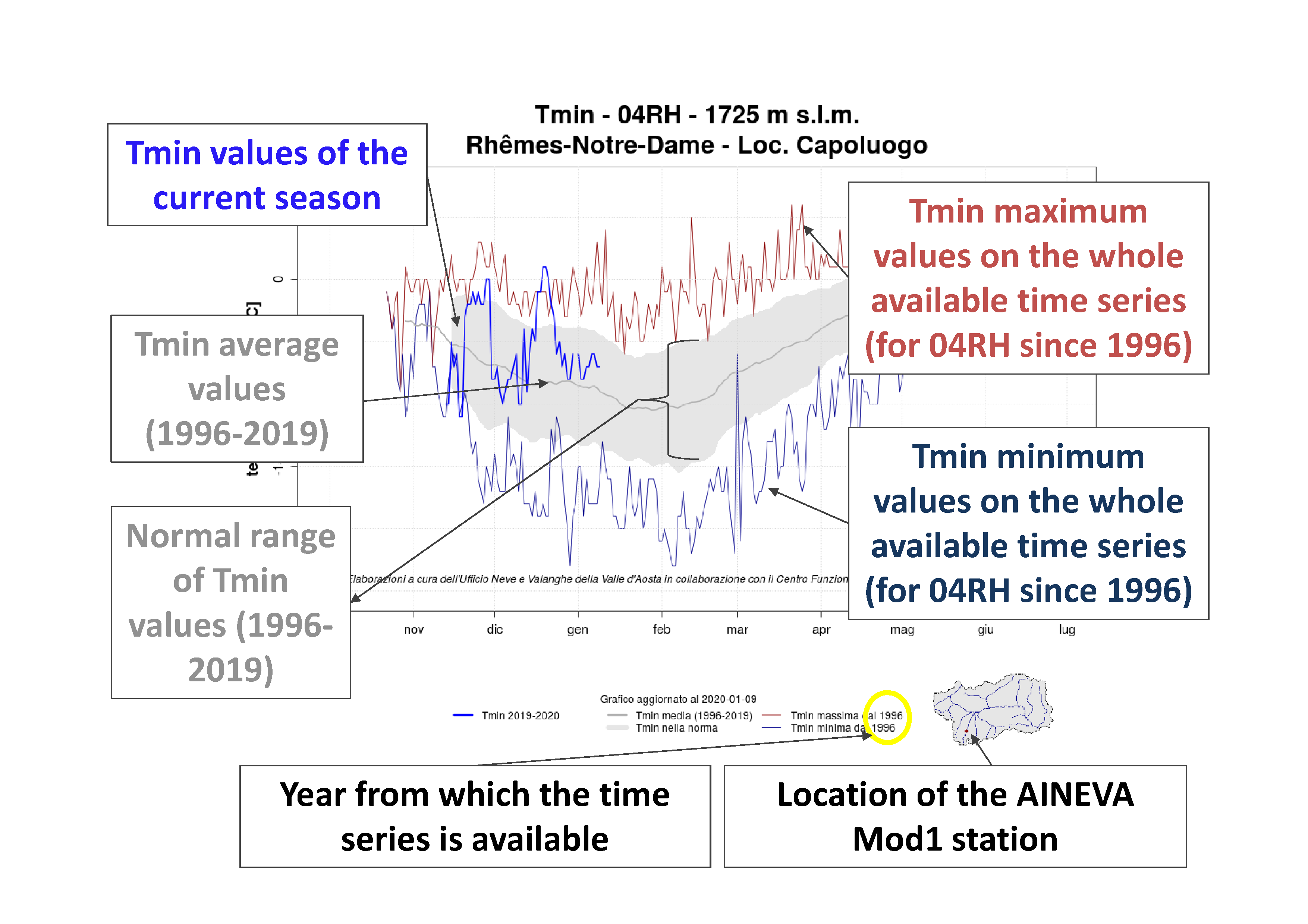
About the minimum temperature graphs (Tmin), each graph shows (Figure 1):
- in bold blue the minimum temperature data (Tmin) for the current season;
- in blue the minimum values of minimum temperature data (Tmin) over the entire available time series. The longest time series (4GAB) starts from 1928, while the shortest (CF01) starts from 2007;
- in red the maximum values of minimum temperature values (Tmin) over the entire available time series. The longest time series (4GAB) starts from 1928, while the shortest (CF01) starts from 2007;
- in grey the normal range of minimum temperature data (Tmin) is shown, considering the period from 1996 until the season preceding the current one (the current season is not taken into account). The grey line, in particular, indicates the mean value of Tmin (averaged with a moving average, over the period from October 1996 until July of the season preceding the current one, except for CF01, whose data are only available after 1996). The grey area instead indicates the value of the standard deviation.

Figure 1: example of a Minimum Temperature Graph - Historical Series with related explanations.
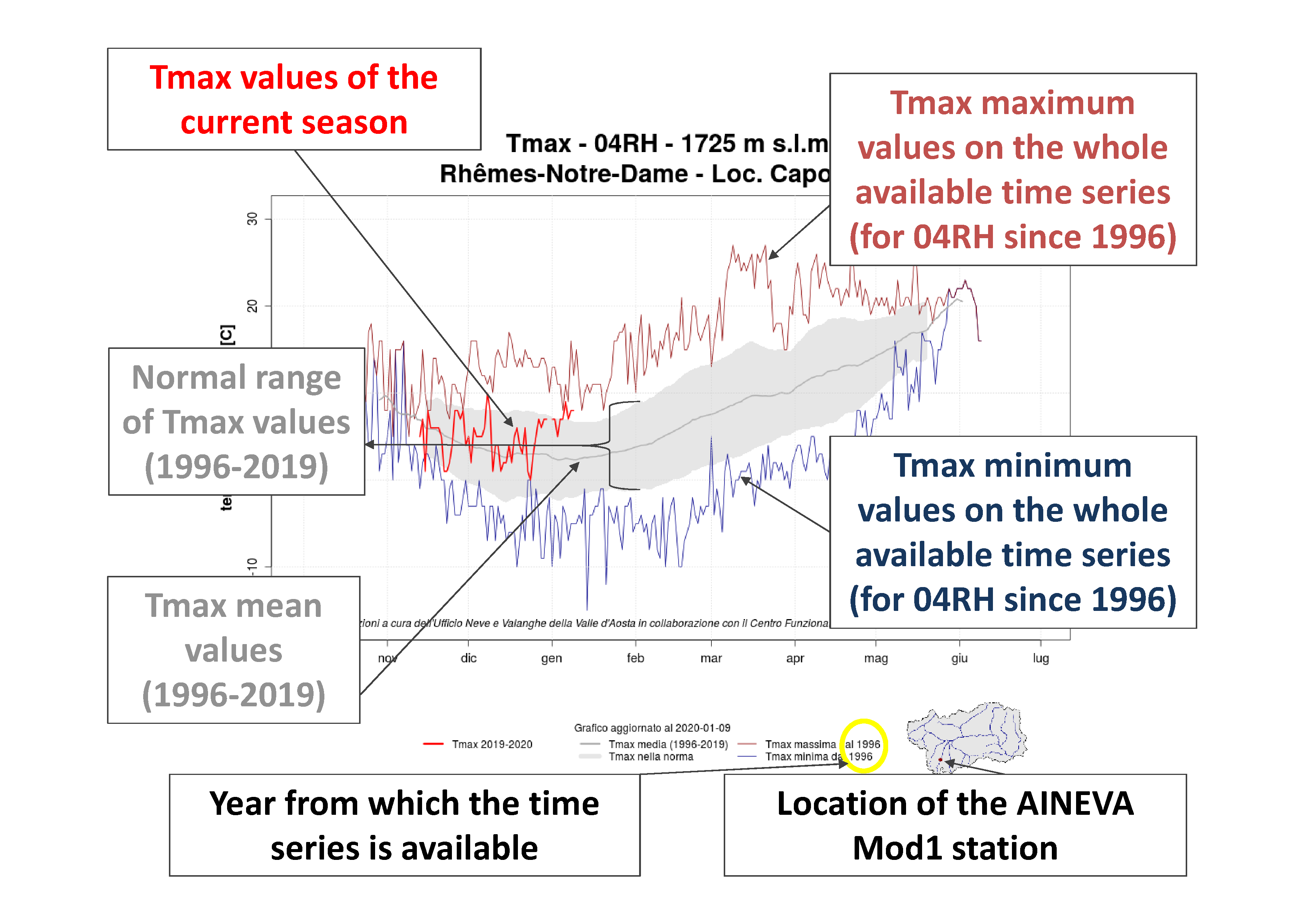
About the maximum temperature graphs (Tmax), each graph shows (Figure 2):
- in bold red the maximum temperature data (Tmax) relating to the current season;
- in blue the minimum values of the maximum temperature (Tmax) over the entire available historical series. The longest time series (4GAB) starts from 1928, while the shortest (CF01) starts from 2007;
- in red the maximum values of the maximum temperature (Tmax) over the entire available historical series. The longest time series (4GAB) starts from 1928, while the shortest (CF01) starts from 2007;
- in grey the normal range data of the maximum temperature (Tmax) are shown, considering the period from 1996 until the season preceding the current one (the current season is not taken into account). The grey line in particular indicates the mean value of Tmax (averaged with a moving average, over the period from October 1996 until July of the season preceding the current one, except for CF01 as the data are only available after 1996). The grey area instead indicates the value of the standard deviation.

Figure 2: example of a Maximum Temperature Graph - Historical Series with related explanations.
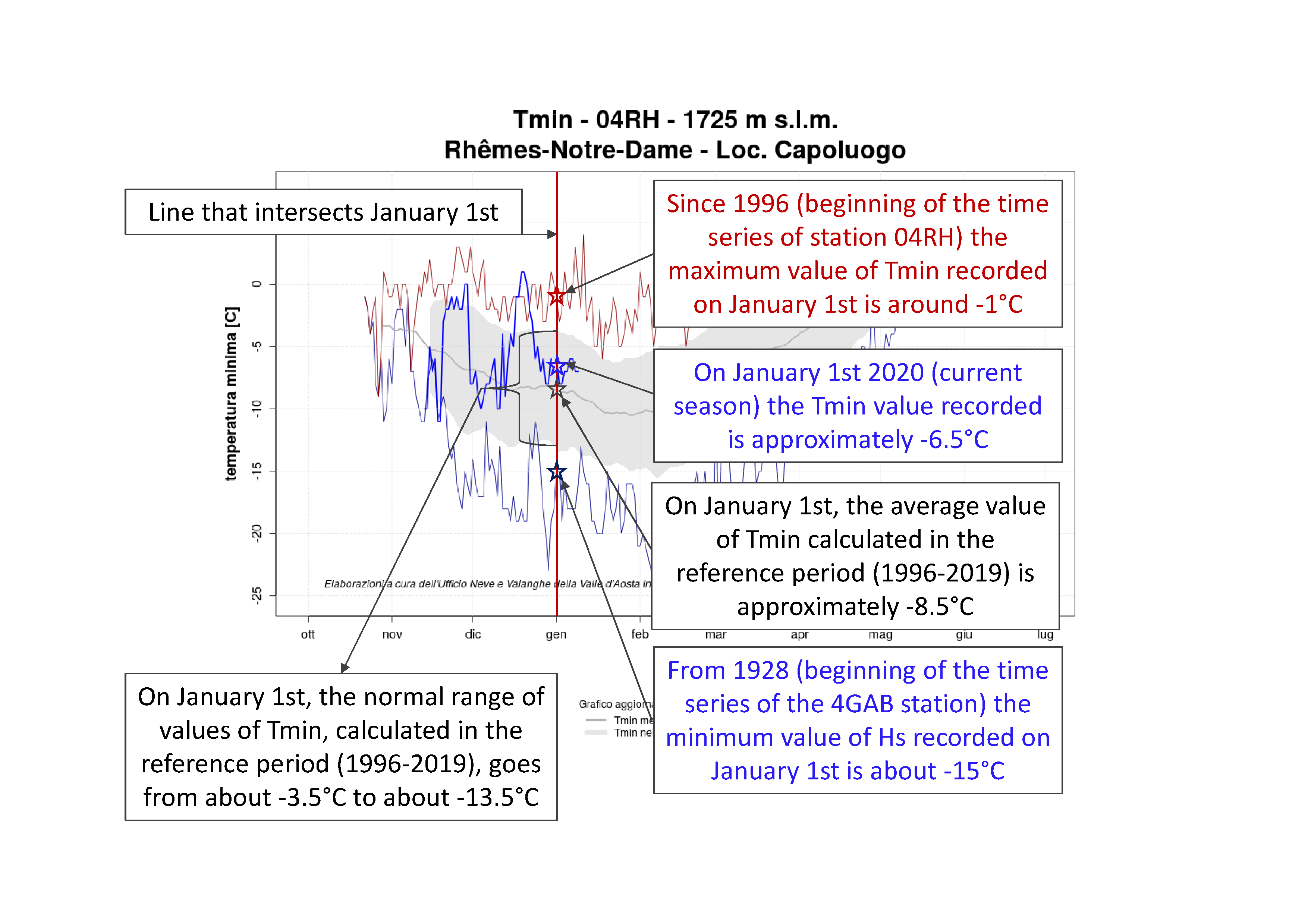
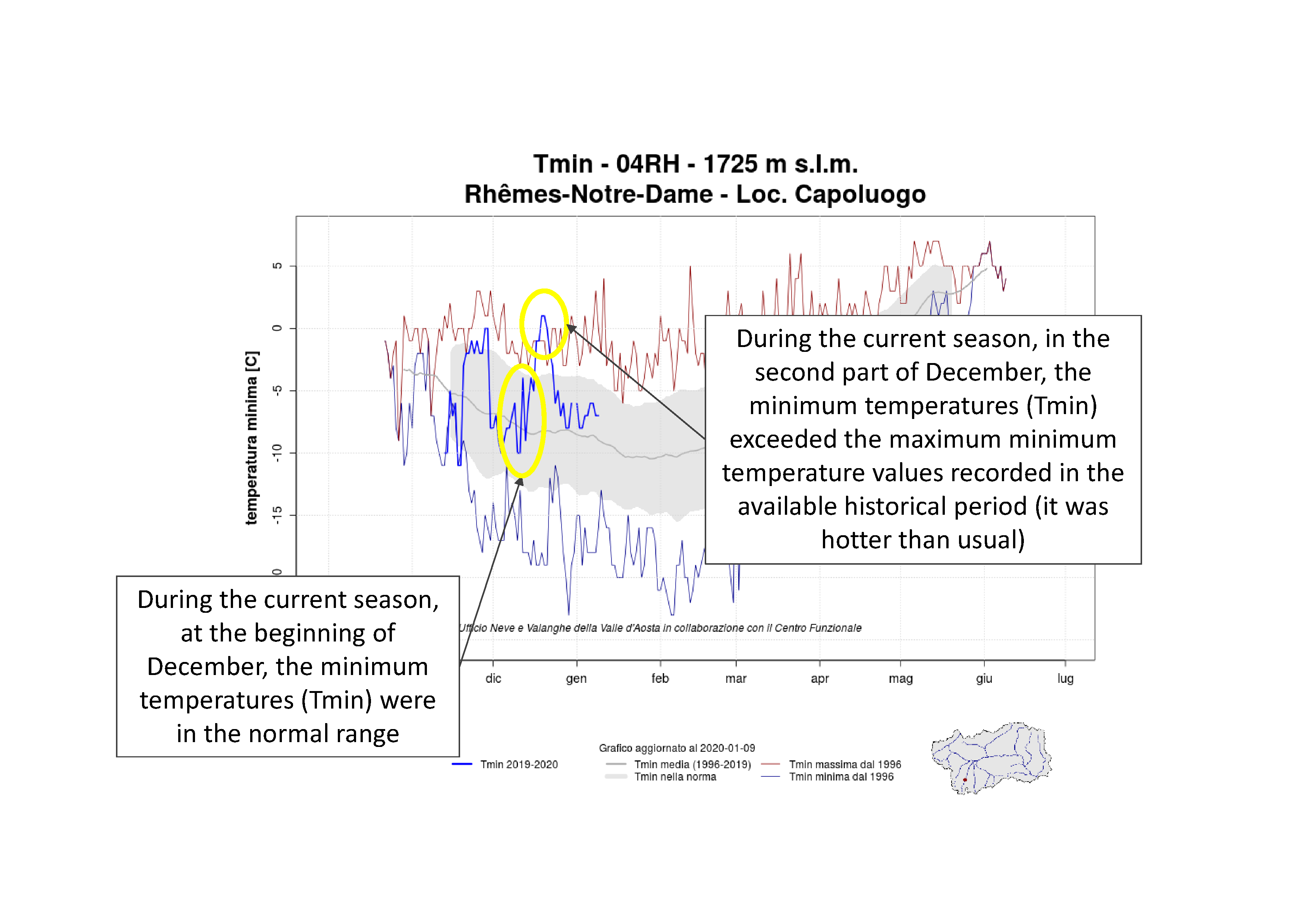
Figures 3 and 4 show examples about how to read a graph.

Figure 3: some information that can be obtained from a Minimum Temperature Graph - Historical Series, analysing a specific day, in the example January 1st.

Figure 4: some information that can be obtained from the Minimum Temperature Graph - Historical Series.